London Bike Rides Dashboard
Client
Personal Project
Duration
1 Day
Category
Data Visualization
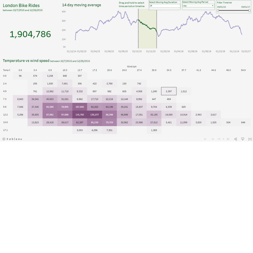
Showing information in a way that's easy to grasp is important for seeing patterns. In this post, we'll go through the steps to make an interactive Tableau dashboard to look at London bike rental information. This project has elements like total bike rides, rolling averages, a heatmap displaying temperature versus wind speed, and charts based on weather and time of day. Let's get into it!
Step 1 - Data Exploration and Preparation
Obtain the London bike sales dataset from Kaggle using the Kaggle API.
Use Python's Pandas library to explore, assess, and manipulate the dataset.
Save the cleaned dataset as 'London_Bikes_Final.xlsx' for Tableau visualization.
Step 2 - Creating Visualizations
Total Bike Rides Visualization
Utilize Tableau to create a line chart showcasing total bike rides over time.
Apply a moving average to smooth out fluctuations and trends.
Moving Average Chart
Generate a line chart illustrating the moving average trend.
Enable dynamic adjustments of the moving average duration via user-defined parameters.
Heatmap: Temperature vs. Wind Speed
Build a heatmap displaying temperature against wind speed.
Use bins to categorize temperature and wind speed for effective visualization.
Weather and Hour Charts
Develop visualizations showcasing bike rides by weather type and hour.
Use bar charts to depict trends and distributions.
Implementing Tooltips for Additional Insights
Configure tooltips to provide detailed information about weather, hours, and more when hovering over the charts.
If you wish to try out the visualization for yourself, here are the links to the resources and the dashboard.
Step 3 - Dashboard Creation
Assembling the Dashboard
Create a dashboard layout in Tableau and integrate the visualizations.
Ensure the dashboard elements are appropriately aligned and sized for a clear view.
Adding Interactivity
Implement filters and set actions to enable users to interact with the data effectively.
Link the moving average period set for dynamic updates across visualizations.
Customization and Formatting
Adjust colours, fonts, and borders to enhance visual appeal and readability.
Refine chart titles, labels, and tooltips for clarity.
Final Touches and Testing
Review the dashboard to ensure all elements are working correctly.
Validate user-defined parameters, set actions, and tooltips for accurate information display.
Conclusion
In this post, we used Tableau to turn London bike data into an easy-to-understand dashboard. We cleaned the data, created charts and graphs, and made it interactive. This project shows how Tableau can make even complex data feel simple and approachable. The same method can be used to understand any data better.
London Bike Rides Dashboard
Client
Personal Project
Duration
1 Day
Category
Data Visualization
Showing information in a way that's easy to grasp is important for seeing patterns. In this post, we'll go through the steps to make an interactive Tableau dashboard to look at London bike rental information. This project has elements like total bike rides, rolling averages, a heatmap displaying temperature versus wind speed, and charts based on weather and time of day. Let's get into it!
Step 1 - Data Exploration and Preparation
Obtain the London bike sales dataset from Kaggle using the Kaggle API.
Use Python's Pandas library to explore, assess, and manipulate the dataset.
Save the cleaned dataset as 'London_Bikes_Final.xlsx' for Tableau visualization.
Step 2 - Creating Visualizations
Total Bike Rides Visualization
Utilize Tableau to create a line chart showcasing total bike rides over time.
Apply a moving average to smooth out fluctuations and trends.
Moving Average Chart
Generate a line chart illustrating the moving average trend.
Enable dynamic adjustments of the moving average duration via user-defined parameters.
Heatmap: Temperature vs. Wind Speed
Build a heatmap displaying temperature against wind speed.
Use bins to categorize temperature and wind speed for effective visualization.
Weather and Hour Charts
Develop visualizations showcasing bike rides by weather type and hour.
Use bar charts to depict trends and distributions.
Implementing Tooltips for Additional Insights
Configure tooltips to provide detailed information about weather, hours, and more when hovering over the charts.
If you wish to try out the visualization for yourself, here are the links to the resources and the dashboard.
Step 3 - Dashboard Creation
Assembling the Dashboard
Create a dashboard layout in Tableau and integrate the visualizations.
Ensure the dashboard elements are appropriately aligned and sized for a clear view.
Adding Interactivity
Implement filters and set actions to enable users to interact with the data effectively.
Link the moving average period set for dynamic updates across visualizations.
Customization and Formatting
Adjust colours, fonts, and borders to enhance visual appeal and readability.
Refine chart titles, labels, and tooltips for clarity.
Final Touches and Testing
Review the dashboard to ensure all elements are working correctly.
Validate user-defined parameters, set actions, and tooltips for accurate information display.
Conclusion
In this post, we used Tableau to turn London bike data into an easy-to-understand dashboard. We cleaned the data, created charts and graphs, and made it interactive. This project shows how Tableau can make even complex data feel simple and approachable. The same method can be used to understand any data better.
London Bike Rides Dashboard
Personal Project
1 Day
Data Visualization
Showing information in a way that's easy to grasp is important for seeing patterns. In this post, we'll go through the steps to make an interactive Tableau dashboard to look at London bike rental information. This project has elements like total bike rides, rolling averages, a heatmap displaying temperature versus wind speed, and charts based on weather and time of day. Let's get into it!
Step 1 - Data Exploration and Preparation
Obtain the London bike sales dataset from Kaggle using the Kaggle API.
Use Python's Pandas library to explore, assess, and manipulate the dataset.
Save the cleaned dataset as 'London_Bikes_Final.xlsx' for Tableau visualization.
Step 2 - Creating Visualizations
Total Bike Rides Visualization
Utilize Tableau to create a line chart showcasing total bike rides over time.
Apply a moving average to smooth out fluctuations and trends.
Moving Average Chart
Generate a line chart illustrating the moving average trend.
Enable dynamic adjustments of the moving average duration via user-defined parameters.
Heatmap: Temperature vs. Wind Speed
Build a heatmap displaying temperature against wind speed.
Use bins to categorize temperature and wind speed for effective visualization.
Weather and Hour Charts
Develop visualizations showcasing bike rides by weather type and hour.
Use bar charts to depict trends and distributions.
Implementing Tooltips for Additional Insights
Configure tooltips to provide detailed information about weather, hours, and more when hovering over the charts.
If you wish to try out the visualization for yourself, here are the links to the resources and the dashboard.
Step 3 - Dashboard Creation
Assembling the Dashboard
Create a dashboard layout in Tableau and integrate the visualizations.
Ensure the dashboard elements are appropriately aligned and sized for a clear view.
Adding Interactivity
Implement filters and set actions to enable users to interact with the data effectively.
Link the moving average period set for dynamic updates across visualizations.
Customization and Formatting
Adjust colours, fonts, and borders to enhance visual appeal and readability.
Refine chart titles, labels, and tooltips for clarity.
Final Touches and Testing
Review the dashboard to ensure all elements are working correctly.
Validate user-defined parameters, set actions, and tooltips for accurate information display.
Conclusion
In this post, we used Tableau to turn London bike data into an easy-to-understand dashboard. We cleaned the data, created charts and graphs, and made it interactive. This project shows how Tableau can make even complex data feel simple and approachable. The same method can be used to understand any data better.
London Bike Rides Dashboard
Client
Personal Project
Duration
1 Day
Category
Data Visualization
Showing information in a way that's easy to grasp is important for seeing patterns. In this post, we'll go through the steps to make an interactive Tableau dashboard to look at London bike rental information. This project has elements like total bike rides, rolling averages, a heatmap displaying temperature versus wind speed, and charts based on weather and time of day. Let's get into it!
Step 1 - Data Exploration and Preparation
Obtain the London bike sales dataset from Kaggle using the Kaggle API.
Use Python's Pandas library to explore, assess, and manipulate the dataset.
Save the cleaned dataset as 'London_Bikes_Final.xlsx' for Tableau visualization.
Step 2 - Creating Visualizations
Total Bike Rides Visualization
Utilize Tableau to create a line chart showcasing total bike rides over time.
Apply a moving average to smooth out fluctuations and trends.
Moving Average Chart
Generate a line chart illustrating the moving average trend.
Enable dynamic adjustments of the moving average duration via user-defined parameters.
Heatmap: Temperature vs. Wind Speed
Build a heatmap displaying temperature against wind speed.
Use bins to categorize temperature and wind speed for effective visualization.
Weather and Hour Charts
Develop visualizations showcasing bike rides by weather type and hour.
Use bar charts to depict trends and distributions.
Implementing Tooltips for Additional Insights
Configure tooltips to provide detailed information about weather, hours, and more when hovering over the charts.
If you wish to try out the visualization for yourself, here are the links to the resources and the dashboard.
Step 3 - Dashboard Creation
Assembling the Dashboard
Create a dashboard layout in Tableau and integrate the visualizations.
Ensure the dashboard elements are appropriately aligned and sized for a clear view.
Adding Interactivity
Implement filters and set actions to enable users to interact with the data effectively.
Link the moving average period set for dynamic updates across visualizations.
Customization and Formatting
Adjust colours, fonts, and borders to enhance visual appeal and readability.
Refine chart titles, labels, and tooltips for clarity.
Final Touches and Testing
Review the dashboard to ensure all elements are working correctly.
Validate user-defined parameters, set actions, and tooltips for accurate information display.
Conclusion
In this post, we used Tableau to turn London bike data into an easy-to-understand dashboard. We cleaned the data, created charts and graphs, and made it interactive. This project shows how Tableau can make even complex data feel simple and approachable. The same method can be used to understand any data better.

