King County House Sales Dashboard
Client
Personal Project
Duration
1 Day
Category
Data Visualization
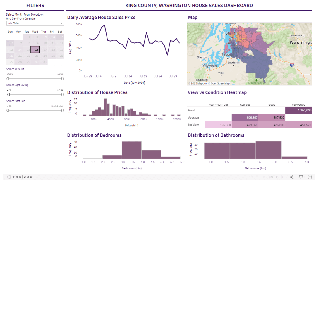
Housing data holds insights but requires thoughtful analysis and impactful visuals. In this post, I’ll walk through building a King County house sales dashboard in Tableau - from planning to validation. Follow along as we construct visualizations, filters, and layouts in crafting an interactive data story published via Tableau Public. You’ll learn concrete dashboard development steps to engage stakeholders.
Step 1 - Gathering Data and Planning the Dashboard
Defining Dashboard Components: Plan the dashboard components—filters, visuals, and their interaction.
Understanding Data Structure: Understand the dataset, including columns like transaction ID, date, price, bedrooms, bathrooms, square footage, view, condition, and geographical details.
Step 2 - Building Visuals for the Dashboard
Line Chart: Display the average house price over time.
Map Visualization: Utilize geographical data and map average prices onto locations.
Histograms: Build distributions for house prices, bedrooms, and bathrooms and offer insights into their frequency distributions.
Heat Map: Showcase correlations between house view and condition against average prices.
Adjust colours, titles, formatting, and tooltip information for cohesive visual appeal.
Step 3 - Creating Interactive Filters
Develop interactive filters for time (month, year), square footage, and year built.
Ensure filters impact visuals selectively and adhere to the requirement of specific filters affecting particular visuals.
Test filters’ functionality to verify the selective impact on visuals and confirm altering filters correctly influences targeted components.
If you wish to try out the visualization for yourself, here are the links to the resources and the dashboard.
Step 4 - Assembling the Dashboard
Create a layout using containers to organize visuals and filters effectively.
Utilize text elements to label and segregate sections within the dashboard.
Ensure proper alignment of visuals and titles for consistency.
Apply formatting adjustments for better readability, such as font changes and dividing lines.
Step 5 - Finalizing and Publishing
Conduct a comprehensive check of filters and visual coherence to validate functionality.
Upload the completed dashboard to Tableau Public, ensuring accessibility for viewing and sharing the interactive project.
Conclusion
And there you have it - a step-by-step guide to building a real estate dashboard in Tableau! We covered everything from planning out the needed components to constructing interactive filters, visuals, and layouts. By following these key steps and best practices for assembling the elements together with care and some testing, you’ll have an informative dashboard up and running to share keen insights into housing data. Happy dashboarding!
King County House Sales Dashboard
Client
Personal Project
Duration
1 Day
Category
Data Visualization
Housing data holds insights but requires thoughtful analysis and impactful visuals. In this post, I’ll walk through building a King County house sales dashboard in Tableau - from planning to validation. Follow along as we construct visualizations, filters, and layouts in crafting an interactive data story published via Tableau Public. You’ll learn concrete dashboard development steps to engage stakeholders.
Step 1 - Gathering Data and Planning the Dashboard
Defining Dashboard Components: Plan the dashboard components—filters, visuals, and their interaction.
Understanding Data Structure: Understand the dataset, including columns like transaction ID, date, price, bedrooms, bathrooms, square footage, view, condition, and geographical details.
Step 2 - Building Visuals for the Dashboard
Line Chart: Display the average house price over time.
Map Visualization: Utilize geographical data and map average prices onto locations.
Histograms: Build distributions for house prices, bedrooms, and bathrooms and offer insights into their frequency distributions.
Heat Map: Showcase correlations between house view and condition against average prices.
Adjust colours, titles, formatting, and tooltip information for cohesive visual appeal.
Step 3 - Creating Interactive Filters
Develop interactive filters for time (month, year), square footage, and year built.
Ensure filters impact visuals selectively and adhere to the requirement of specific filters affecting particular visuals.
Test filters’ functionality to verify the selective impact on visuals and confirm altering filters correctly influences targeted components.
If you wish to try out the visualization for yourself, here are the links to the resources and the dashboard.
Step 4 - Assembling the Dashboard
Create a layout using containers to organize visuals and filters effectively.
Utilize text elements to label and segregate sections within the dashboard.
Ensure proper alignment of visuals and titles for consistency.
Apply formatting adjustments for better readability, such as font changes and dividing lines.
Step 5 - Finalizing and Publishing
Conduct a comprehensive check of filters and visual coherence to validate functionality.
Upload the completed dashboard to Tableau Public, ensuring accessibility for viewing and sharing the interactive project.
Conclusion
And there you have it - a step-by-step guide to building a real estate dashboard in Tableau! We covered everything from planning out the needed components to constructing interactive filters, visuals, and layouts. By following these key steps and best practices for assembling the elements together with care and some testing, you’ll have an informative dashboard up and running to share keen insights into housing data. Happy dashboarding!
King County House Sales Dashboard
Personal Project
1 Day
Data Visualization
Housing data holds insights but requires thoughtful analysis and impactful visuals. In this post, I’ll walk through building a King County house sales dashboard in Tableau - from planning to validation. Follow along as we construct visualizations, filters, and layouts in crafting an interactive data story published via Tableau Public. You’ll learn concrete dashboard development steps to engage stakeholders.
Step 1 - Gathering Data and Planning the Dashboard
Defining Dashboard Components: Plan the dashboard components—filters, visuals, and their interaction.
Understanding Data Structure: Understand the dataset, including columns like transaction ID, date, price, bedrooms, bathrooms, square footage, view, condition, and geographical details.
Step 2 - Building Visuals for the Dashboard
Line Chart: Display the average house price over time.
Map Visualization: Utilize geographical data and map average prices onto locations.
Histograms: Build distributions for house prices, bedrooms, and bathrooms and offer insights into their frequency distributions.
Heat Map: Showcase correlations between house view and condition against average prices.
Adjust colours, titles, formatting, and tooltip information for cohesive visual appeal.
Step 3 - Creating Interactive Filters
Develop interactive filters for time (month, year), square footage, and year built.
Ensure filters impact visuals selectively and adhere to the requirement of specific filters affecting particular visuals.
Test filters’ functionality to verify the selective impact on visuals and confirm altering filters correctly influences targeted components.
If you wish to try out the visualization for yourself, here are the links to the resources and the dashboard.
Step 4 - Assembling the Dashboard
Create a layout using containers to organize visuals and filters effectively.
Utilize text elements to label and segregate sections within the dashboard.
Ensure proper alignment of visuals and titles for consistency.
Apply formatting adjustments for better readability, such as font changes and dividing lines.
Step 5 - Finalizing and Publishing
Conduct a comprehensive check of filters and visual coherence to validate functionality.
Upload the completed dashboard to Tableau Public, ensuring accessibility for viewing and sharing the interactive project.
Conclusion
And there you have it - a step-by-step guide to building a real estate dashboard in Tableau! We covered everything from planning out the needed components to constructing interactive filters, visuals, and layouts. By following these key steps and best practices for assembling the elements together with care and some testing, you’ll have an informative dashboard up and running to share keen insights into housing data. Happy dashboarding!
King County House Sales Dashboard
Client
Personal Project
Duration
1 Day
Category
Data Visualization
Housing data holds insights but requires thoughtful analysis and impactful visuals. In this post, I’ll walk through building a King County house sales dashboard in Tableau - from planning to validation. Follow along as we construct visualizations, filters, and layouts in crafting an interactive data story published via Tableau Public. You’ll learn concrete dashboard development steps to engage stakeholders.
Step 1 - Gathering Data and Planning the Dashboard
Defining Dashboard Components: Plan the dashboard components—filters, visuals, and their interaction.
Understanding Data Structure: Understand the dataset, including columns like transaction ID, date, price, bedrooms, bathrooms, square footage, view, condition, and geographical details.
Step 2 - Building Visuals for the Dashboard
Line Chart: Display the average house price over time.
Map Visualization: Utilize geographical data and map average prices onto locations.
Histograms: Build distributions for house prices, bedrooms, and bathrooms and offer insights into their frequency distributions.
Heat Map: Showcase correlations between house view and condition against average prices.
Adjust colours, titles, formatting, and tooltip information for cohesive visual appeal.
Step 3 - Creating Interactive Filters
Develop interactive filters for time (month, year), square footage, and year built.
Ensure filters impact visuals selectively and adhere to the requirement of specific filters affecting particular visuals.
Test filters’ functionality to verify the selective impact on visuals and confirm altering filters correctly influences targeted components.
If you wish to try out the visualization for yourself, here are the links to the resources and the dashboard.
Step 4 - Assembling the Dashboard
Create a layout using containers to organize visuals and filters effectively.
Utilize text elements to label and segregate sections within the dashboard.
Ensure proper alignment of visuals and titles for consistency.
Apply formatting adjustments for better readability, such as font changes and dividing lines.
Step 5 - Finalizing and Publishing
Conduct a comprehensive check of filters and visual coherence to validate functionality.
Upload the completed dashboard to Tableau Public, ensuring accessibility for viewing and sharing the interactive project.
Conclusion
And there you have it - a step-by-step guide to building a real estate dashboard in Tableau! We covered everything from planning out the needed components to constructing interactive filters, visuals, and layouts. By following these key steps and best practices for assembling the elements together with care and some testing, you’ll have an informative dashboard up and running to share keen insights into housing data. Happy dashboarding!

